Sliding Hamburger Menus are the new design trend on the internet that has taken cues from mobile design algorithms. For those of you who don’t know, a Sliding Hamburger Menu is the menu in which you can hit a button and a menu will slide out from the left/top/right. Sliding Hamburger Menus are incredibly popular because they allow you to keep a clean look to your website without having to have a line of text to navigate the website unless the user wants to access it.
However, getting a sliding hamburger menu right is crucial to ensuring that it works well on your website and doesn’t become a hindrance. Therefore, we thought we would dish out 5 tips and tricks for sliding hamburger menus to enhance and optimise your menus so they work the best, look the best and are just the best in general. These tips and tricks include visual tips, implementation tips and more. So here are our 5 tips and tricks for sliding hamburger menus.
Browser Support
Sliding Hamburger Menus are great because they just work most of the time. However, there are multiple browsers you have to think of these days. The big one is Chrome, if your menu works on Chrome then you’re 50% of the way there. However, you really want to ensure that your menu works on all browsers as there are many countries out there that mainly use FireFox or Opera browser. And with the improvements of Safari over the past few years and the constant overpowering of iPhones on the market, there’s a big browser too.
Make The Menu Placement Clear
One thing you’ve got to ensure is that the placement of the menu is clear to your audience. This is key because, for the most part, you need to make sure that the users can find it and then suitably navigate your website how you want them to. Viewers and users can easily miss out on key information too if you don’t have the menu placement and visibility correct. We’d recommend using as minimal colour differences on your website as possible, potentially using black or white as the background with variations being slight colour differences on white. Using these two base colours as your background allows you to easily use a contrasting colour for your menu icon, making it easier to find. Also, positioning is important to finding it. We’d recommend having the icon in the top left as this is where most people are used to finding it on mobile devices, however as long as it’s visible, top middle or top left are perfectly suitable. Using a sticky icon would be great too to allow users to navigate wherever they are on your page.
Use a Recognisable Icon
This tip is similar to the last in making sure that your sliding hamburger menu is clear to the audience. In this case, you need to make sure they know what they’re looking for and to use an icon that they would recognise as the menu button. The staple look is the three short horizontal lines. This is the design used on all iPhone and Android apps and most websites too. However, as long as your icon is visibly the menu icon, you can be as creative as you want. You could use an arrow, two lines or whatever you’d like. We’d recommend not using text as this is visually unappealing and clicking on text is never as satisfying as clicking on a button.
Mobile Performance
This one may be an obvious tip these days. However, you’ve almost got to make sure your website’s menu works well on a mobile platform these days. A lot of the time, most sliding hamburger menu plugins work on both mobile and desktop also. However, there’s no harm in testing your website on every possible device you own from laptops, to tablets and mobile phones. We’d also recommend testing on different browsers on your mobile devices, for example, both Safari and Chrome on iOS and Chrome, Dolphin, Opera and other such browsers on Android.
Having mentioned Sliding Hamburger Menu plugins, we’ve decided to pick out a few of the best for you to use to save you the time of searching for ages. The majority are built for jQuery since it’s the most popular JavaScript library, but there are others available.
 Slideout.js
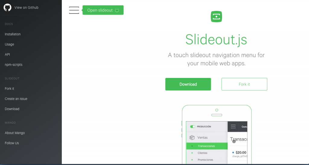
Slideout.js is one of the most comprehensive sliding hamburger menus you can get. It’s not exactly and more of a JavaScript library that offers one of the smoothest sliding hamburger menus out there, concentrating on simplicity and allowing you to have the smoothest and most fluid experience for your menu.
Formstone Navigation

Formstone Navigation is another simple and easy to use sliding hamburger menu. This plugin allows you another great experience when it comes to creating a menu of such style. It offers few customization options and optimises itself on making a great and fluid experience, but this is why we love it here as it allows you to quickly implement such a menu with great effectiveness.
Pure Drawer

Pure Drawer is one of our favourite sliding hamburger menus here at Wiproo as it offers up one of the best experiences for both implementing and customising your menu. The website linked allows you to not only reposition the menu button to see where you favourite position is, but it also gives you the choice of 14 different animation options, allowing you to pick your favourite place and the nicest animation to work with.